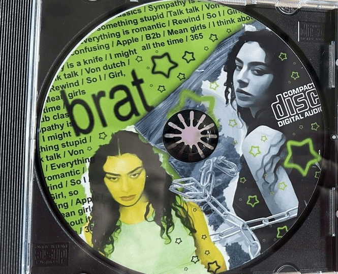
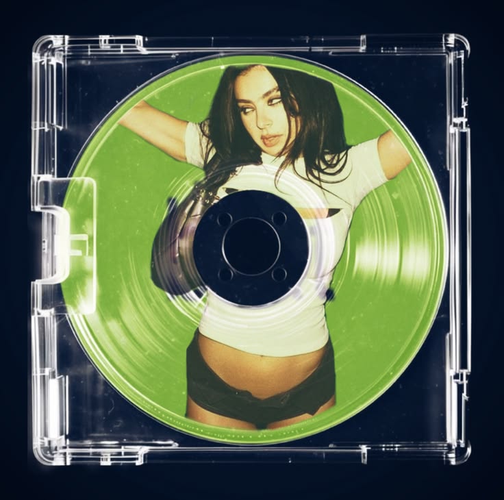
Existing Identity- Brat’s visual identity is built around a deliberately raw, confrontational and anti-polished aesthetic. Instead of traditional pop-star branding, it embraces imperfection, chaos and immediacy.
BRAT COLOR PALLETE

8D8D8D

121212

FFF34D

8BCE00

WHY THE IDENTITY BECAME RECOGNISABLE

the identity is recognisable because it commits heavily to a small number of distinctive elements. Instead of constantly introducing new visual styles, Brat repeats and reinforces its core language until the colour, typography and attitude become synonymous with the brand.
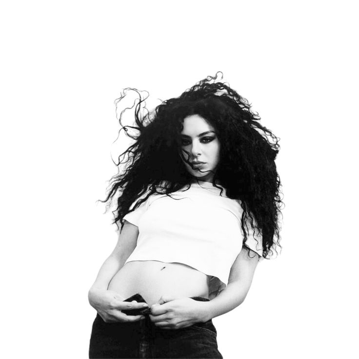
RAW

RAW


**

Ironically, Brat was one of the year's boldest departures from the polished, predictable sound of mainstream pop. The risk paid off: what initially felt unconventional quickly became a defining cultural moment, embraced by fans and met with strong critical acclaim.


**

Ironically, Brat was one of the year's boldest departures from the polished, predictable sound of mainstream pop. The risk paid off: what initially felt unconventional quickly became a defining cultural moment, embraced by fans and met with strong critical acclaim.

001

Cultural Impact

The rollout of *Brat* combined forward-thinking digital marketing with more familiar promotional strategies, creating a campaign that felt both current and incredibly cohesive. The “Apple” TikTok dance became one of the defining trends of the summer, while a subtler move saw Charli’s previous album covers temporarily adopt the *Brat* visual identity, quietly teasing the new era.


The campaign continued to build momentum through the deluxe release, remixes and tour, extending *Brat* far beyond the initial album drop. What started as a distinct visual identity eventually became a much larger cultural phenomenon.

002

Brand DNA

Personality: Unapologetic, chaotic, provocative and self-aware, rejecting the polished perfection usually associated with pop.

Visual Identity: A minimal but instantly recognisable system built around acid green, distorted typography and deliberately low-fi imagery.

Typography & Colour: The stretched black type and fluorescent green work together as the core visual assets, making the identity immediately identifiable.

Photography & Graphic Language: Flash photography, imperfect framing, low-resolution imagery and simple layouts create a raw, spontaneous and intentionally unpolished aesthetic.

Create a free website with Framer, the website builder loved by startups, designers and agencies.